Brand Identity — 2026


.png)
DR BLANCS is a videography and video editing brand with real craft behind it — but no visual identity to match. The work spoke volumes; the branding said nothing. The brief was clear: build a mark and system worthy of the frames they produce.
The identity leans on deep blacks, off-white tones, and a single burnt-orange accent that nods to the warm grade of premium cinematography. The wordmark is set with architectural precision — designed to hold across title cards, watermarks, and motion graphics without losing integrity.
DR BLANCS now has a brand presence as deliberate as their editing — a complete identity system with primary mark, usage guidelines, and a colour and type system that scales from phone screens to cinema titles.
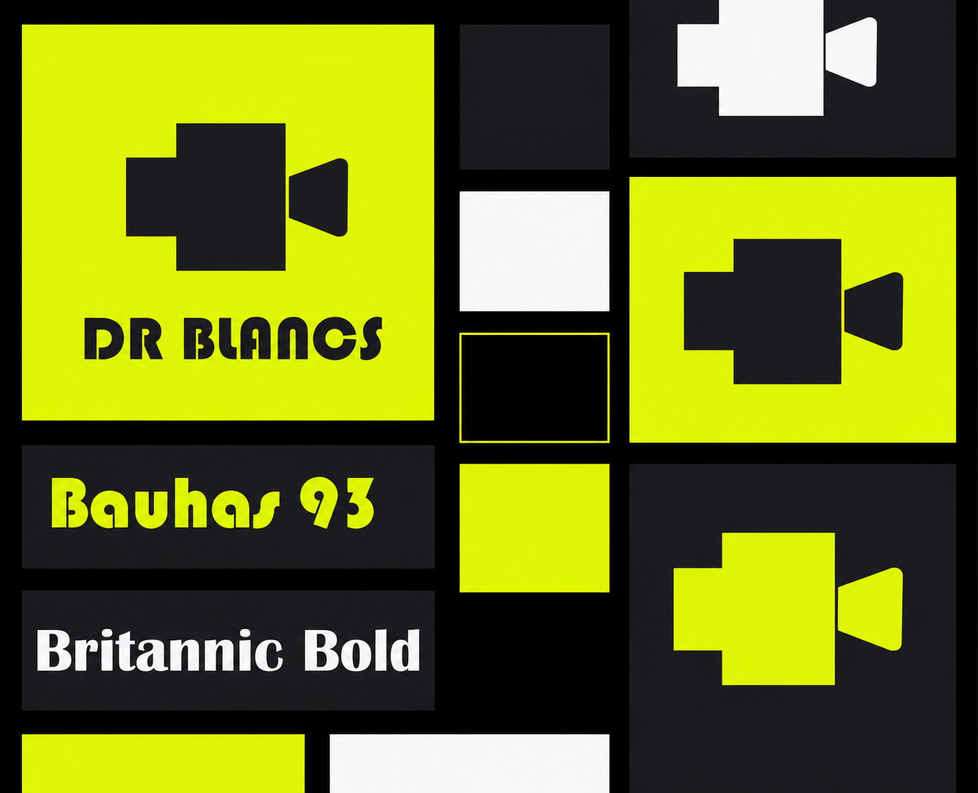
DR BLANCS needed a brand identity as considered as their cinematography. The result is a monochrome-first visual system with cinematic weight — a mark that holds at any size, on any surface, before any frame plays.
← Back to Portfolio ↗Build a complete brand identity for a videography and video editing studio — one that communicates craft, precision, and cinematic seriousness without relying on clichéd film imagery.
A portfolio-ready brand identity that demonstrates command of typographic precision, monochrome design systems, and motion-aware brand thinking in a competitive creative services space.