Brand Identity — 2026
 (3).png)
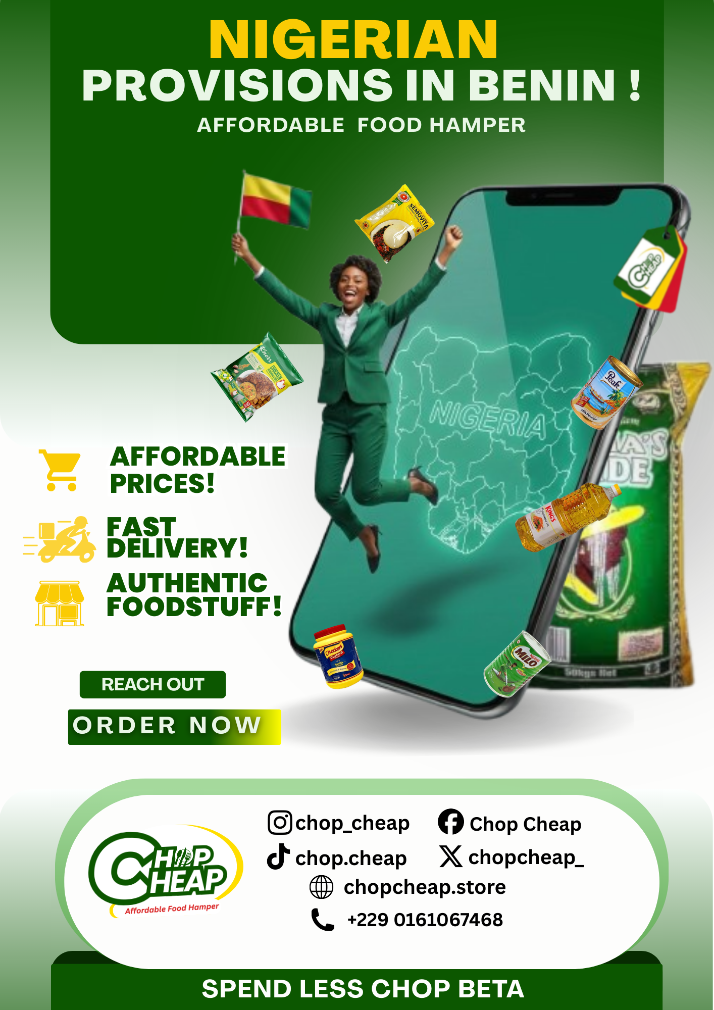
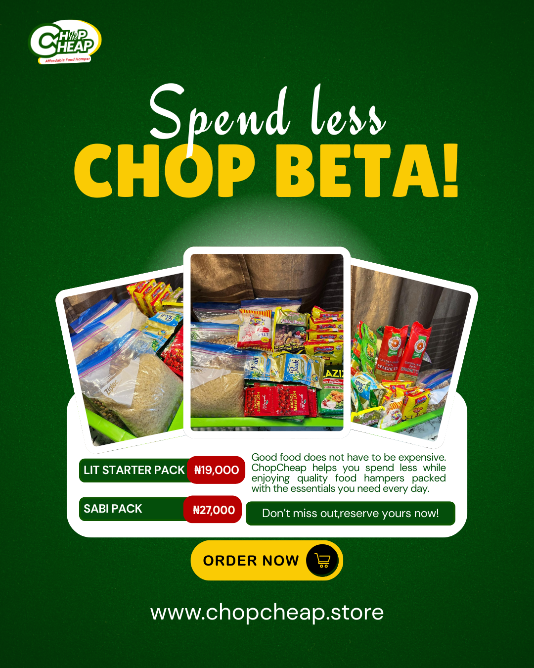
For many Nigerian students and families living in Benin Republic, crossing the border to buy affordable foodstuffs simply isn't an option — the distance, cost, and logistics make it unreachable. Chop Cheap was built to close that gap: a food hamper service that brings Nigerian staples directly to people who need them most, without the border run.
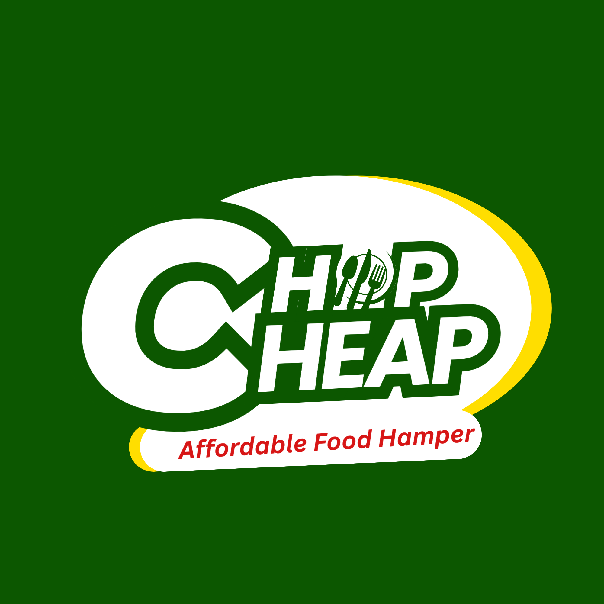
The identity was built to feel instantly familiar to the audience — green for fresh produce and Nigerian market energy, yellow for warmth, accessibility, and the brightness of getting what you need without the stress. The custom double-C logotype with embedded cutlery device communicates food and value in one glance, at any size, on any surface.
Chop Cheap now has a complete logo suite — dark-background version for digital, full-colour version for print and packaging — alongside a brand system rooted in the real lives of the students and households it serves. The identity earns trust before the first hamper is even opened.
Dark Version — Primary
 Light Version — Alternate
Chop Cheap is a food hamper service for Nigerian students and households in Benin Republic who don't have the reach or means to cross the border for affordable foodstuffs. The brand identity needed to feel familiar, trustworthy, and rooted in the community it serves — not another generic grocery logo.
← Back to Portfolio ↗Design a brand identity for a food hamper business serving Nigerian students and diaspora households in Benin Republic — people cut off from border food markets by distance, cost, and logistics. The brand needed to feel like a trusted community solution, not a generic delivery service.
A complete brand identity that demonstrates community-centred brand thinking — building visual trust for a service that solves a real, specific problem for Nigerians living away from home and away from the border markets they'd usually rely on.