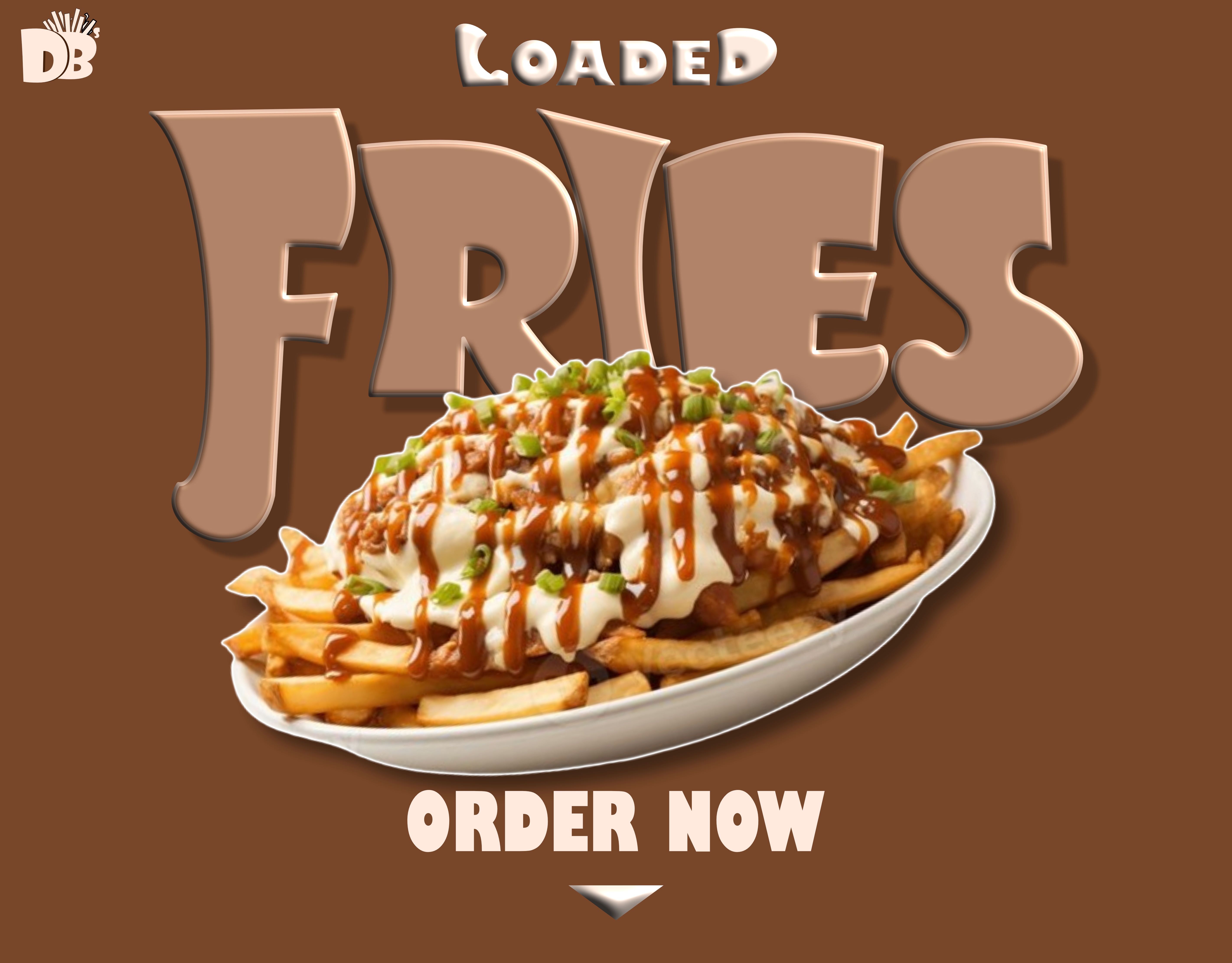
DB Loaded Fries — brand logo
Brand Identity — 2025
DB
LOADED

Category Brand Identity
Tool Affinity Designer · CANVA
Year 2025
Industry Food & Beverage
01 — The Problem
BOLD
FOOD,
BLAND
FACE
Loaded fries that deserved louder branding
02 — The Approach
RICH.
WARM.
STREET.
Typography with the energy of the food itself
03 — The Result
A MARK
AS BOLD
AS THE
MENU
Brand ready for packaging and social
The Problem
A loaded fries brand with nothing loaded about its visual identity

DB Loaded Fries serves generous, layered, flavour-packed fries — the kind of food that should announce itself before the first bite. But their branding was understated to the point of invisibility. The brief: build something that hits as hard as the food does.

Brand Strategy Logo Design Food Branding
Design Approach
Rich brown. Cream. A wordmark that bursts off the bag.

The identity is built around a deep chocolate-brown palette with warm cream lettering — colours that feel appetising, unpretentious, and immediately communicative of comfort food done right. The logomark uses an expressive, energetic style with fry-burst iconography that reads instantly at any scale.

1
Primary Mark
3+
Lockup Variants
2
Colour Modes
The Outcome
A brand identity that sells the experience before the first bite

DB Loaded Fries now has a visual identity that matches the energy of what they serve — an expressive, bold mark with a warm palette ready for packaging, social media, and signage at any scale.
Logo Suite Packaging Ready Brand Colour Social Ready
COLOR &
TYPOGRAPHY
Loaded Brown #3B1C08
Deep Fry #1A0C04
Salted Cream #F5D9A0
Cream Peach #F5D9C8
Paper Wrap #F0E8D8
Display / Bebas Neue
DB
LOADED
Body / Syne
Generous, flavour-packed loaded fries — the kind that stain your fingers, fill you up, and make you come back tomorrow without thinking twice.
Mono / Space Mono
ORDER: FULLY LOADED
SIZE: LARGE
TOPPINGS: ALL OF THEM
Accent / Cormorant Garamond
"Every fry tells you
exactly what it is."
THE
MARK
DB Loaded Fries logo
01
Primary Mark
LOGO &
ICON
The DB mark with its expressive fry-burst device — bold, readable, and built for packaging, signage, and social media.
02
Colour System
WARM &
APPETISING
Rich browns and warm cream — the visual language of street food done with personality and pride, not corporate polish.
03
Application
PACK &
PRINT
Designed to hold on packaging, stickers, wrapping paper, and social graphics — everywhere a loaded fries brand needs to show up.
DB
ABOUT THE
PROJECT

DB Loaded Fries needed a brand identity that matched the energy of their product — bold, warm, street-smart, and impossible to ignore. The result is an expressive wordmark with custom icon and a rich brown palette that sells the experience before the first bite.

← Back to Portfolio ↗
The Brief

Design a brand identity for a loaded fries food brand — one that communicates boldness, warmth, and appetite without looking like every other fast-food logo in the market.

Deliverables
Primary Logo & Icon Alternate Lockups Brand Colour Palette Typography Guidelines Usage & Application Rules
Tools Used
Affinity Designer (Identity Design) Loaded Brown System (Colour)
Impact

A complete brand identity that demonstrates food branding expertise — expressive iconography, bold colour decisions, and a system that scales from packaging to social without losing personality.

MORE
PROJECTS

View All Works →
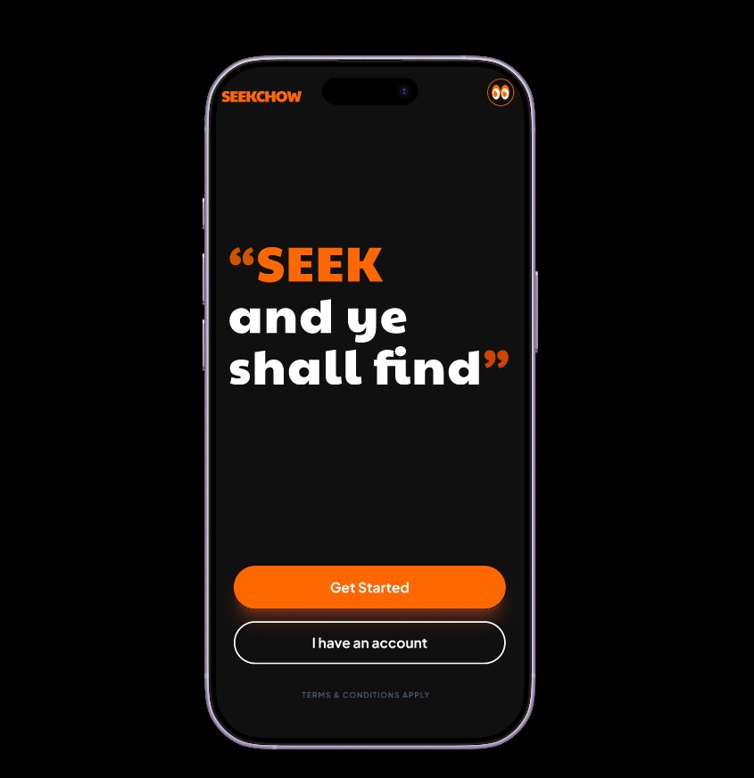
SeekChow
SeekChow
Mobile UI↗
Caly Luxury
Caly Luxury
Brand Identity↗
Dr. Blancs
Dr. Blancs
Brand Identity↗
©AJANI™ 2026 // All rights reserved
> DB LOADED FRIES — Brand Identity 2026